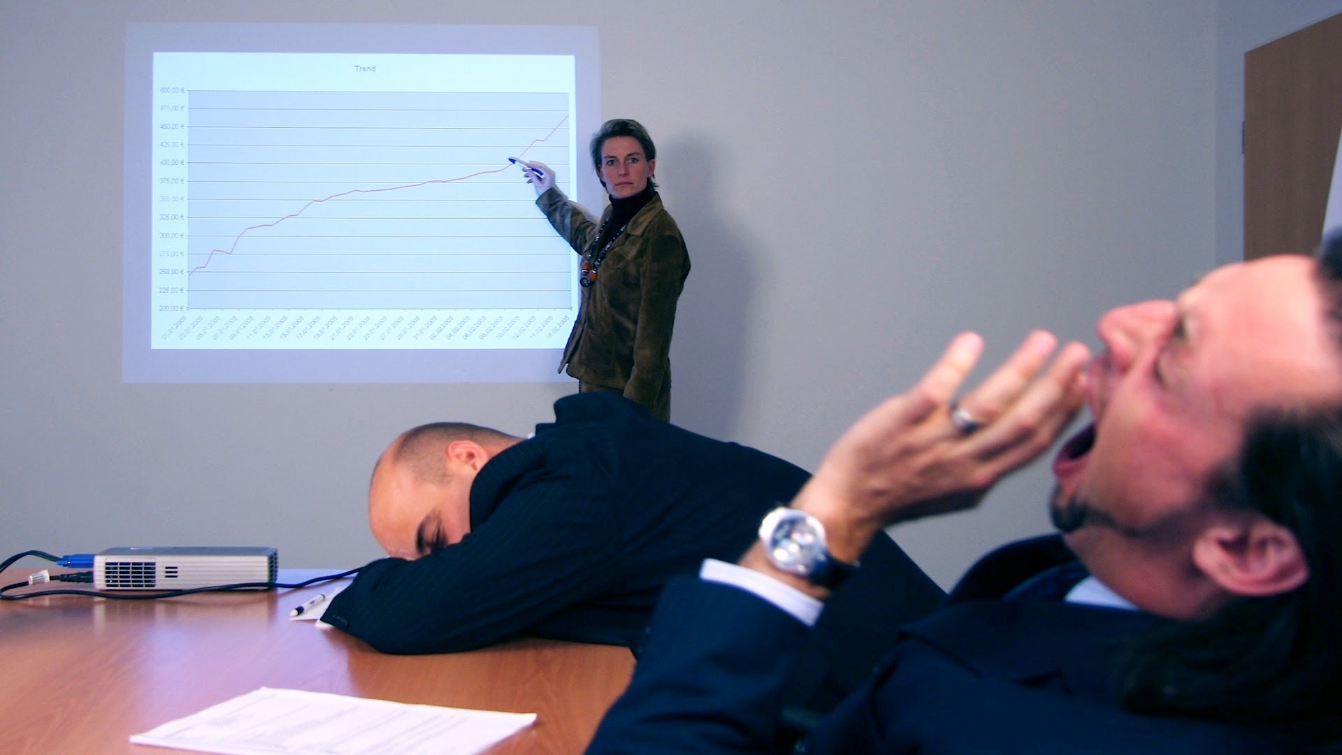
It doesn’t come as a surprised that Powerpoint presentations are the star of the show during a business meeting. They’re rather efficient in many ways and have the power to hold attention due to the visual interest it possesses. Unfortunately, Powerpoint presentations can also end up being a disaster for those who make these powerpoint no-nos. You want to make sure your presentation is actually a visual aid and not a visual eyesore.

Transitions and Sound Effects
Adding transitions and sound effects can cause your presentation to end up being distracting for the audience. You’ll want them to focus on the text and data, not on how the slides bounce up and down when you click next. Another downside to adding transitions and sound effects is that when you run it on a much slower computer, it may lag. Unless the powerpoint is intended for a creative presentation, try to leave out all the comical effects and transitions. Put more emphasis on your text and not on how it swirls around before landing on the page.
Generic Clipart
Adding clipart to your slides may result into it looking like a major cliché. If you need to add graphics to your slide to further enhance your message, avoid cliparts and use your own images instead. Alternatively, when laying out details from a website or an application, you could add screen captures.
Template
Sometimes, when using a template, you are putting your creative tendencies in someone else’s box. Furthermore, templates are sometimes just a bad mix of bad color combinations and tacky backgrounds. What you could do instead is to learn a thing or two about graphic design basics and use this knowledge on your presentation slides.
Overwhelming Text
When presenting information on a topic, try to avoid fitting all the text into one slide. It can come across as text-heavy and overwhelming. The most effective way is to have a maximum of five lines of text and to use key words and phrases to get your point across. By doing this, your audience will be able to absorb your information better. You can choose to elaborate on it further orally, when you present your powerpoint.
Text Size Matters
If you think size doesn’t matter, think again. Most presenters forget that the powerpoint is also for audiences not sitting a meter away from the projector screen. Your text should be large enough that even someone sitting 10 meters away can read it. To create an effective presentation, go for a minimum font size of 40. In addition to that, make sure all other elements such as graph descriptions are big enough to be read.
Reading
A presentation should be focused on active participation from both ends. This means interaction between the speaker and the audience and not merely reading. Speaking and writing revolve around differing rules. Speaking is more casual and direct. As a presenter, you must be able to hold a person’s attention. If they spend more time reading handouts rather than paying attention to you, then you have failed as a presenter.
No Backup
While I’m usually an optimist, I don’t believe in not being prepared, especially when doing important work. Always, always, always have a backup ready. You never know when something might go wrong at the last minute. Worse comes to worst, you might have to do a presentation without any visual aid. Therefore, you also need to familiarize yourself with what you’re presenting, too. Not only will this help you look more educated about your presentation, but it will also help you be prepared in case there are questions raised.
Avoiding these mistakes will surely yield you great results. If these are mistakes you used to commit, don’t worry! There’s still time to redeem yourself and blow everyone away with your great presentation.
